I recently gathered fish harvest data from the U.S. National Oceanic and Atmospheric Administarion (NOAA), which I downloaded from Infochimps. The data is fish harvest by weight and value, by species for 21 years, from 1985 to 2005.
Here is a link to a google document of the data I used below. I had to do some minor pocessing in Excel first; thus the link to this data.
https://spreadsheets.google.com/ccc?key=0Aq6aW8n11tS_dFRySXQzYkppLXFaU2F5aC04d19ZS0E&hl=en
Get the original data from Infochimps here http://infochimps.com/datasets/domestic-fish-and-shellfish-catch-value-and-price-by-species-198
# Fish harvest data
setwd("/Mac/R_stuff/Blog_etc/Infochimps/Fishharvest") # Set path
library(ggplot2)
library(googleVis)
library(Hmisc)

fish <- read.csv("fishharvest.csv") # read data
fish2 <- melt(fish,id=1:3,measure=4:24) # melt table
year <- rep(1985:2005, each = 117)
fish2 <- data.frame(fish2,year) # replace year with actual values

# Google visusalization API
fishdata <- data.frame(subset(fish2,fish2$var == "quantity_1000lbs",-4),value_1000dollars=subset(fish2,fish2$var == "value_1000dollars",-4)[,4])
names(fishdata)[4] <- "quantity_1000lbs"
fishharvest <- gvisMotionChart(fishdata, idvar="species", timevar="year")
plot(fishharvest)
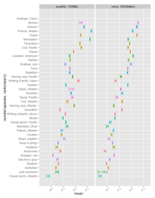
fishdatagg2 <- ddply(fish2,.(species,var),summarise,
 mean = mean(value),
 se = sd(value)/sqrt(length(value))
)
fishdatagg2 <- subset(fishdatagg2,fishdatagg2$var %in% c("quantity_1000lbs","value_1000dollars"))
limit3 <- aes(ymax = mean + se, ymin = mean - se)
bysppfgrid <- ggplot(fishdatagg2,aes(x=reorder(species,rank(mean)),y=mean,colour=species)) + geom_point() + geom_errorbar(limit3) + facet_grid(. ~ var, scales="free") + opts(legend.position="none") + coord_flip() + scale_y_continuous(trans="log")
ggsave("bysppfgrid.jpeg")