UPDATE: changed data source so that the entire example can be run by anyone on their own machine. Also, per Joachim’s suggestion, I put a box around the blown up area of the map. In addition, rgeos and maptools removed, not needed.
Here’s a quick demo of creating a map with an inset within it using ggplot. The inset is achieved using the gridExtra package.
Install libraries
install.packages(c("ggplot2", "maps", "grid", "gridExtra"))
library("ggplot2")
library("maps")
library("grid")
library("gridExtra")
Create a data frame
dat <- data.frame(ecosystem = rep(c("oak", "steppe", "prairie"), each = 8),
    lat = rnorm(24, mean = 51, sd = 1), lon = rnorm(24, mean = -113, sd = 5))
head(dat)
#>   ecosystem      lat       lon
#> 1       oak 49.58285 -107.6930
#> 2       oak 52.58942 -116.6920
#> 3       oak 50.49277 -114.5542
#> 4       oak 50.05943 -116.5660
#> 5       oak 51.76492 -112.1457
#> 6       oak 52.82153 -112.8858
Get maps using the maps library
Get a map of Canada
canadamap <- data.frame(map("world", "Canada", plot = FALSE)[c("x", "y")])
Get a map of smaller extent
canadamapsmall <- canadamap[canadamap$x < -90 & canadamap$y < 54, ]
canadamapsmall_ <- na.omit(canadamapsmall)
This should get your corner points for the box, picking min and max of lat and lon
(insetrect <- data.frame(xmin = min(canadamapsmall_$x), xmax = max(canadamapsmall_$x),
    ymin = min(canadamapsmall_$y), ymax = max(canadamapsmall_$y)))
#>        xmin      xmax     ymin     ymax
#> 1 -133.0975 -90.38942 48.04721 53.99915
Make the maps
Create a theme to be used by both plots
ptheme <- theme(
  panel.border = element_rect(colour = 'black', size = 1, linetype = 1),
  panel.grid.major = element_blank(),
  panel.grid.minor = element_blank(),
  panel.background = element_rect(fill = 'white'),
  legend.key = element_blank()
)
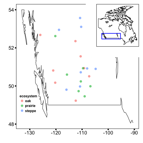
The inset map, all of Canada
a <- ggplot(canadamap) +
	theme_bw(base_size = 22) +
	geom_path(data = canadamap, aes(x, y), colour = "black", fill = "white") +
	geom_rect(data = insetrect, aes(xmin = xmin, xmax = xmax, ymin = ymin, ymax = ymax), alpha = 0, colour = "blue", size = 1, linetype = 1) +
  ptheme %+% theme(
    legend.position = c(0.15, 0.80),
    axis.ticks = element_blank(),
    axis.text.x = element_blank(),
    axis.text.y = element_blank()
  ) +
	labs(x = '', y = '')
The larger map, zoomed in, with the data
b <- ggplot(dat, aes(lon, lat, colour = ecosystem)) +
	theme_bw(base_size = 22) +
	geom_jitter(size = 4, alpha = 0.6) +
	geom_path(data = canadamapsmall, aes(x, y), colour = "black", fill = "white") +
	scale_size(guide = "none") +
  ptheme %+% theme(
    legend.position = c(0.1, 0.20),
    legend.text = element_text(size = 12, face = 'bold'),
    legend.title = element_text(size = 12, face = 'bold'),
    axis.ticks = element_line(size = 2)
  ) +
	labs(x = '', y = '')
Print maps
One an inset of the other. This approach uses the gridExtra package for flexible alignment, etc. of ggplot graphs.
grid.newpage()
vpb_ <- viewport(width = 1, height = 1, x = 0.5, y = 0.5)  # the larger map
vpa_ <- viewport(width = 0.4, height = 0.4, x = 0.8, y = 0.8)  # the inset in upper right
print(b, vp = vpb_)
print(a, vp = vpa_)
Written in Markdown, with help from knitr, and nice knitr highlighting/etc. in in RStudio.