The problem:
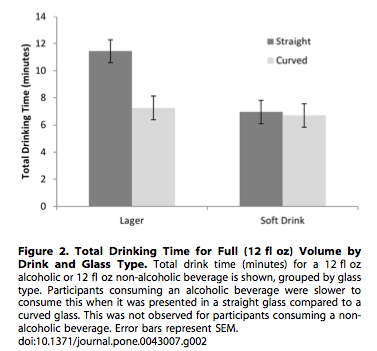
There are a lot of figures in published papers in the scholarly literature, like the below, from (Attwood et. al. 2012)):
At some point, a scientist wants to ask a question for which they can synthesize the knowledge on that question by collecting data from the published literature. This often requires something like the following workflow:
- Search for relevant papers (e.g., via Google Scholar).
- Collect the papers.
- Decide which are appropriate for inclusion.
- Collect data from the figures using software on a native application. Examples include GraphClick and ImageJ.
- Proof data.
- Analyze data & publish paper.
This workflow needs revamping, particularly in step number 3 - collecting the data. This data remains private, moving from one closed source (original publication) to another (personal computer). We can surely do better.
A solution
The data collection process (Step 3 above) can make use of modern technology, and be based in the browser. Some benefits of a browser based data collection approach:
- Cross-platform: a data digitization program that lives in the browser can be more easily cross-platform (Linux/Mac/Windows) than a native app.
- Linked data: with the increasing abundance of APIs (application programming interfaces), we can link the data going into this app to anything of interest. This is not so easy in a native app.
- Automatic updates: a web based browser can be updated easily without requiring a user to go get updates.
- User-based: a web based browser can easily integrate secure user login so that users can be associated with data collected, allowing for quantification of user-based error, and eventually user based scores/badges/etc. if so desired.
For those concerned about a browser based approach to data collection from figures, it will likely be possible to make it work offline as well, then send data up to servers when connected to the web again.
What would be great about having data be public by default is that the work would be reproducible easily, at least on the data side of things. Hopefully the researchers would make all their code available publicly to recreate their analyses.
Question: Why would this idea work?
Better question: Why wouldn’t it work!
I think this idea could be awesome. The reason I think it could be is based on two observations:
- There is a seemingly endless supply of academic papers with figures in them from which data can be extracted.**
- There is increasing use of meta-analysis in science, which is fed by just this kind of data.
** p.s. in the future, perhaps we will move to all SVG format figures or something even better, in which case data can be extracted from the underlying XML
Okay, maybe it’s a good idea, but who owns the data in figures in published papers?
As far as I know, and I’ve checked with a few knowledgeable people, no one owns this data. So it’s ripe for the digitizing!
Open access
I want this project to be totally open access (and I hope you do too). I love models like GitHub where everything is public by default (unless you are an enterprise user, exceptions, exceptions), and I think that is what this requires. You may be thinking though: “But I am collecting data for my meta-analysis and I don’t want to share the data with anyone else”. My answer: “I understand where you are coming from, but it doesn’t seem very likely that someone will be asking the exact same question as you and be looking for the data from the exact same papers”. There will just be a huge database of data from figures, and all the appropriate metadata of course. Anyone should be able to use this.
APIs
It would be great to build this from the start having an API in mind. That is, how do we need to structure the data to be easily served up in an API to other websites, or pulled down to someone’s local machine within Python or R to do data manipulation, analysis, and visualization? We are going to need a key-value store database, such as MongoDB/CouchDB because ideally at least we would store the data collected, the figure itself, use information, etc.
What is being done about this?
I was fortunate enough to tag along with Ted Hart, a postdoc at UBC, on a recently submitted NCEAS working group proposal. Who knows if we’ll get it, but we are already working on a prototype, so we will hit the ground running if we get funded, and just hit the ground, but walk a bit slower if we don’t get the funding.
What could this be in the future?
At least in my mind, I think of this idea going the direction of gamification, including points, badges, etc., sort of like FoldIt or GalaxyZoo. At first we need alpha-, then beta-testers, which I imagine will most likely be academics exracting data for a meta-analysis for example. But in the future, it would be great to make the interface enjoyable enough to attract non-academics, which could greatly increase the speed of data collection.
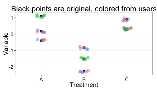
Once there are a lot of people collecting data we can get many data points for every single data point in a graph. Whereas right now, someone clicks on each data point in a graph one, maybe two times if they are lucky. In the future, we could have ten different users clicking on each mean and each error bar in each graph. So exciting! The following figure illustrates this.
What do you think?
Is this idea totally insane? Is it do-able? Is it worth doing?
Get the .Rmd file used to create this post at my github account - or .md file.
Written in Markdown, with help from knitr, and nice knitr highlighting/etc. in in RStudio.
References
Attwood AS, Scott-Samuel NE, Stothart G, Munafò MR and Laks J (2012). “Glass Shape Influences Consumption Rate For Alcoholic Beverages.” Plos One, 7. http://dx.doi.org/10.1371/journal.pone.0043007.