Have you ever wanted to easily visualize your ecology data in Google Earth? R2G2 is a new package for R, available via R CRAN and formally described in this Molecular Ecology Resources article, which provides a user-friendly bridge between R and the Google Earth interface. Here, we will provide a brief introduction to the package, including a short tutorial, and then encourage you to try it out with your own data!
Nils Arrigo, with some help from Loren Albert, Mike Barker, and Pascal Mickelson (one of the contributors to Recology), has created a set of R tools to generate KML files to view data with geographic components. Instead of just telling you what the tools can do, though, we will show you a couple of examples using publically available data. Note: a number of individual files are linked to throughout the tutorial below, but just in case you would rather download all the tutorial files in one go, have at it (tutorial zip file).
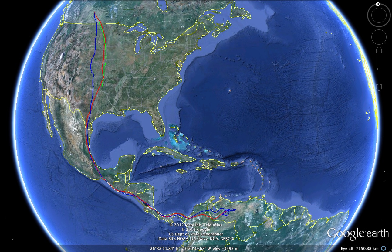
Among the basic tools in R2G2 is the ability to place features—like dots, shapes, or images (including plots you produced in R)— that represent discrete observations at specific geographical locations. For example, in the figure below, we show the migratory path of a particular turkey vulture in autumn of three successive years (red = 2009; blue = 2010; green = 2011).

Google Earth imagery showing migratory path of a particular turkey vulture in 2009, 2010, and 2011.
We use the PolyLines2GE function that is part of R2G2 to create line segments between the geographical coordinates which have been obtained from a turkey vulture tagged with a transponder (data accessed via the Movebank Data Repository and is from the Turkey Vulture Acopian Center USA GPS). The PolyLines2GE function looks like the following:
PolyLines2GE(coords = vulture_path[,2:3],
			nesting = vulture_path[,1],
			colors = "auto",
			goo = "Vulture_Path.kml",
			maxAlt = 1e4,
			fill = FALSE,
			closepoly = FALSE,
			lwd = 2,
			extrude = 0)
It expects to receive an array (“coords”) containing latitude and longitude coordinates in decimal degrees. Additionally, each individual coordinate has a flag associated with it (“nesting”) so that each data series can be distinguished. Illustrating what you need is easier than explaining:
nesting longitude latitude
1	long1A		lat1A
1	long1B		lat1B
1	long1C		lat1C
2	long2A		lat2A
2	long2B		lat2B
3	long3A		lat3A
3	long3B		lat3B
3	long3C		lat3C
Feeding the columns of this array to the function results in three differently colored lines: the first would connect the coordinates 1A-1B-1C, while the second would connect 2A-2B, and the third would connect 3A-3B-3C. The only other user-defined input that is strictly necessary is the output file name (“Vulture_Path.kml” in this case). The other options—which allow you control of the appearance of the lines and of the altitude at which your line displays in Google Earth—have reasonable defaults that are well-documented in the function definition itself. Check out this example in Google Earth by downloading the KML file. Alternatively, download the annotated R script and generate the KML file for yourself.
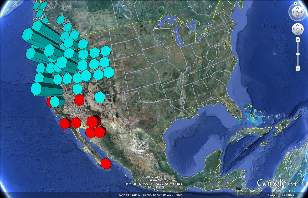
Now, let’s say you wanted to get a sense of the range and abundance of two congeneric species. In this second example, we use the Hist2GE function to create a histogram—overlaid on the surface of the earth—which shows the species distribution of Mimulus lewisii (red) and Mimulus nasutus (blue) in North America.

Google Earth imagery showing the species distribution of Mimulus lewisii and Mimulus nasutus
As you might expect, each polygon represents an occurrence of the species in question, while the height of the polygon represents the abundance of the species at that geographic location. Species occurring within a particular distance of each other have been grouped together for the histogram. For this example, we retrieve data from the GBIF database from within R (see the example code for how that is done). Inputs to the Hist2GE function are:
Hist2GE(coords = MyCompleteData[, 8:7],
		species = MyCompleteData[, 1],
		grid = grid10000,
		goo = "Mimulus",
		nedges = 6,
		orient = 45,
		maxAlt = 1e4)
As in the first example, the function expects to receive an array containing the longitude and latitude (“coords”), a vector distinguishing individual observations (“species”), and an output file name (“goo”). In this case, however, we also need to specify the size of the grid we will use to group observations together to construct the histogram. Several pre-defined grid sizes are included in the package to do this grouping; these all cover large geographic areas and therefore must account for the curvature of the earth. Here is a list of these pre-defined grids:
| Grid Name | Approximate Area of Grid Division |
|---|---|
| grid20000 | 25,500 sq. km |
| grid10000 | 51,000 sq. km |
| grid5000 | 102,000 sq. km |
| grid500 | 1,020,000 sq. km |
| grid50 | 10,200,000 sq. km |
For smaller geographic areas (less than 25,000 square kilometers, or an area of about 158 km per side), you can customize the grid size by specifying the bounds of your region of interest in decimal degrees, as well as the coarseness of the grid within that region. While it is possible to use this custom grid definition for larger sizes, beware that not all areas defined thusly will be of equal size due to the earth’s curvature (obviously the bigger you go, the worse it gets…). Finally, you again have control over the display parameters of the histogram. In particular, the maximum altitude (“maxAlt”) controls how high the tallest bar in the histogram will go. Here is the resulting KML file, as well as the annotated R script so you can further explore the example.
More complex visual representations are also possible using R2G2. For instance, you can also create contour plots or phylogenies overlaid directly on the surface of the earth. We included a couple examples of this type in our Molecular Ecology Resources article, and if the response seems good, we may post a follow up tutorial showing how we went about creating those examples.
It is our sincere hope that you will use the tools in R2G2 to more effectively visualize the geographical aspects of your data. In particular, we are excited about the potential for incorporating R2G2 into data analysis pipelines connecting analysis in R with data visualization and exploration in Google Earth. Ultimately, the inclusion of KML files as supplementary materials to journal articles should also enrich one’s understanding of the data being presented!
Note: If you make something cool using R2G2, please post a link to your KML file in the comments; we would love to see!Citation information for R2G2:
Arrigo, N., Albert, L. P., Mickelson, P. G. and Barker, M. S. (2012), Quantitative visualization of biological data in Google Earth using R2G2, an R CRAN package. Molecular Ecology Resources. doi: 10.1111/1755-0998.12012